We moved to a new Home! DAILY HYPOTHESIS

Hi CHA REVIEWS fans,

We have moved to a new home with the same standards and breaking news and covering a large variety of TOPICS. Politics, MUSIC, TECH, and COMICS only at dailyhypothesis.wordpress.com. Daily Hypothesis will be the home to every insight and analysis of every topic. So stay tuned.

Make 3D round photos (kind of panorama)

– via Tech Crunch

What if you could shoot those cool 360-degree, swivel-around photos you see on ecommerce sites or in The Matrix with just your smartphone? Then you’d be using the 3DAround camera app that launches next month from Dacuda, which gave TechCrunch an early peek. Simply hit record, revolve your camera phone or tablet around an object, and 3DAround stitches together all the photos into a 3D image the viewer can spin at will.

3DAroundDacuda is famous for itsPocketScan app that lets you wave your camera over a document to get a digital image of it without a bulky scanner. Now Dacuda’s 25-person team and 5 years of experience are combining to make your phone a 3D scanner that always gets the perfect angle…because it gets every angle. For starters, it’s going to add some 360-spice to a ubiquitous but often boring type of photograph.

“It’s a really good time for this kind of tech because Apple just opened up the camera APIs” Dacuda founder and CTO Dr. Alexander Ilic tells me. “We need pretty much low-level access to controlling exposure time, focus, and more.” That’s just what Apple allowed with iOS 8.

Illic says the inspiration for the app came from watching food blogger friends take dozens of photos of plates of grub from different angles and struggle to decide which was best. He thought “Why can’t you just go around the whole thing, so you don’t have to worry about the perfect shot with a single angle.” Originally he figured that would require a camera with expensive 3D sensors, but in fact, newer iPhones are capable if given the right software. That’s where Dacuda comes in.

Spun out of top Swiss engineering school ETH Zurich by students from the university and MIT, Dacuda’s expertise is in image stitching. It’s backed by Wellington Partners, Swiss bank Schwyzer Kantonalbank, and Austrian entrepreneur Hans-Peter Metzler.

Screen Shot 2014-10-24 at 1.05.03 PM

The 3DAround app extracts depth and structure information from a success of rapid-fire photos to create the 360-degree views. You’ll be able to interactively view the swivel-able photo through the 3DAround app or WebGL-equipped browsers like Chrome, and share some version of the images to Facebook, Twitter, and Pinterst

The app will launch for free next month on iOS 8 devices for the iPhone 5 on up. While some phones like the HTC EVO now have stereoscopic double cameras that can take slightly “3D” photos, 3DAround looks like the real deal. We’ll have hands-on coverage once the app launches, so check back to see us spinning around some delicious food.

Lenovo Has Completed The $2.91 Billion Acquisition Of Motorola From Google

– via Techo Crunch

Lenovo has completed the $2.91 billion acquisition of Motorola from Google today. The deal, which was announced in January, comes just three years after Google itself shelled out $12.5 billion to buy the phone-maker.

Now a Lenovo subsidiary, Motorola will continue to be based out of Chicago with offices worldwide. Motorola Mobility President Rick Osterloh will retain in his position following the deal, with Liu Jun, Lenovo’s executive vice president and president of its Mobile Business Group, becoming chairman of the Motorola board.

Writing on Motorola’s company blog, Osterloh made a point of explaining that it will be business as usual despite the change in ownership:

“The iconic Motorola brand will continue, as will the Moto and DROID franchises that have propelled our growth over the past year. We will continue to focus on pure Android and fast upgrades, and remain committed to developing technology to solve real consumer problems. And we will continue to develop mobile devices that bring people unprecedented choice, value and quality.”

Yang Yuanqing, Chairman and CEO of Lenovo, spoke of the companies’ bold ambition:

“Today we achieved a historic milestone for Lenovo and for Motorola – and together we are ready to compete, grow and win in the global smartphone market. By building a strong number three and a credible challenger to the top two in smartphones, we will give the market something it has needed: choice, competition and a new spark of innovation.”

Microsoft’s $7.2 billion acquisition of Nokia closed earlier this year and was almost immediately followed by a downscaling program that will ultimately see 18,000 redundancies before the end of this year. Motorola shed thousands of jobs under Google’s parentage — 4,000 in August 2012, over 1,000 in October 2012, and 1,200 in March 2013 — and the fact that Osterloh says Motorola will maintain its global offices suggests that there are no immediate job cuts.

IDC’s latest report ranked Lenovo fourth on smartphone shipments in Q3 2014, with fellow Chinese company Xiaomi ranked higher than it (third) for the first time. In addition to buying Motorola, Lenovo has more plans up its sleeve after it revealed this month that it will launch a Xiaomi-like smartphone business for the Chinese market in 2015

The Droid Turbo is a souped-up Moto X for Verizon

– via The Verge

Discover

Google’s approach for rolling out the latest version of Android, Lollipop, is a little different. There are the usual things we see every year — a new Nexus phone and a new Nexus tablet — but instead of a big event, the company is posting details in blog posts and on the main Android site. So if you’re tracking the rollout closely, you probably have a sense of what’s new and what’s cool in the OS. If you’re not, though, getting a sense of what Lollipop is actually like and what it actually does isn’t easy.

Luckily, we got a chance to sit down with some Google execs last week to get a walkthrough of the coolest features. We won’t know everything until we actually have a chance to use the final version, but there are some clever additions we saw last week. Here are some of our favorites.

Tap and Go: Android has never been particularly good at transferring your settings and apps from an old phone to a new one. It’s always been a crap shoot as to whether all your apps would actually be downloaded from the Play store, to say nothing of your home screen and wallpaper. That’s partially Google’s fault, but it’s also a difficult problem to solve because of the diversity of hardware and software in the Android ecosystem. “Tap and Go” is a small step towards resolving that. If you have two Lollipop phones, you can pair them with NFC and the old phone will then use Bluetooth to send over all the details of what your phone should have installed over to the new phone.

Ok Google: Several of the enhancements on Lollipop were inspired by Motorola. The first is the ability to say “Ok Google” even if your phone is in standby mode. Your phone will wake and then you can use voice to search, send texts, and more. It requires compatible hardware, though, and so far we only know for sure that the Nexus 6 and Nexus 9 support it.

Double tap to wake: Speaking of waking up your Android device, you can just double tap the screen of the Nexus 9 tablet to wake it up. Like the advanced “Ok Google” command, it requires compatible hardware. We also hear it works on the Nexus 6.

NEXUS GETS SOME OF THE BEST FEATURES FROM THE MOTO X

Ambient Display: Another feature that’s made it over from the Moto X is the idea of displaying bits of information on your screen as it comes in without turning the whole thing on. On the Nexus 6, it’s much more advanced — basically you get black and white versions of what would normally be on the lock screen anyway. It requires an OLED screen to work, so for now it seems like this is going to be a Nexus 6-specific feature.

Face unlock: Android’s face unlock feature has never really worked all that well. It’s kind of magical that it can recognize your face, but it’s often slow and usually needs really good lighting conditions to work. In Lollipop, Google has tweaked it so that it starts running silently as soon as you turn on your screen. Since you can interact with notifications on the lock screen now (see below), the idea is that you’d power it on, mess with a few notifications, and by the time you’re done Face Unlock has already kicked in and unlocked the phone.

Lock screen notifications: As with the iPhone, Android Lollipop will put notifications right on your lock screen. But on Android, the notifications on your screen are basically the same as those that appear in the drop-down notification shade. Why does that matter? Because on Android, you get a lot of control built-in to those notifications. You can archive email, tap reply, expand notifications to see more information, and so on. Now, you can do it directly on your lock screen. As a small bonus, if you have apps with sensitive information that you want to see notifications from but don’t want to display their contents, you can set them to be “redacted” when they show up on the lock screen.

Priority Mode: But the best notification enhancement in Lollipop is something Google calls “Priority Mode.” It’s a little bit like “Do Not Disturb” on iOS but it seems much smarter here. You can easily choose which apps can still disturb you when in Priority Mode (the rest won’t bug you). Even better, when you set it, Android gives you the option to set a duration before it goes back into normal notifications. That way, you won’t forget to switch it off. There’s also a total silence mode that will turn everything off — including alarms.

Guest Mode: Android has allowed multiple user accounts on tablets for awhile, but in Lollipop there’s a new option called Guest Mode that works on both phones and tablets. The idea is that it creates a clean, safe, and disposable workspace that anybody can use. Your guest can even quickly log in to their account to check email. You or your guest can get rid of the data inside the guest account at any time.

THE NEXUS 9 IS EASY TO HAND TO YOUR KIDS

Pin Apps: Sometimes Guest Mode is too much work, and all you really want to do is launch a game and hand your phone to your kid — but not let them leave that game to mess with your email. Lollipop has a new feature (enabled in settings) that adds a pin to each card in the mulititasking view. When you tap it, that app won’t let you leave without entering a passcode. It’s similar to the “Guided Access” feature in iOS, but a little easier to use.

Improved Quick Settings: Quick Settings have been reorganized again, and they’re a bit easier to figure out now. Plus, the brightness slider you’ll find there is a little bit smarter: by default it responds correctly to ambient light at any brightness level. Speaking of sliders, the volume slider that pops up when you hit the volume key is also smarter: it has the buttons for the various Priority Notification modes right there.

Overview: The multitasking view now has a new name, Overview, and a new Material Design look. Each app is a big card, stacked up, and you can scroll through many more recent apps than you used to be able to. But the best feature is that any app can create multiple “cards.” So, for example, when you compose a new email your inbox is still in the overview, so you can switch back and forth between tasks in a single app.

Material Design: The best and most obvious feature in Lollipop comes last. It’s a complete redesign that we already got a good look at this past summer, but there are new designs pretty much everywhere. One example: the contact card. Android adds a dynamically-created color overlay to each photo based on an accent color from the photo itself. Red lipstick, red overlay. Orange sweater, orange overlay. It’s a nice touch.

This article was updated to reflect that double tap to wake reportedly works just fine on the Nexus 6. We regret the original error.

Apple iPad mini 3 review

– via The Verge

Q: What new in iPad Mini 3?

A: A touch ID ….. sorry but it’s the same as old one

For the past few years, most of the technology world has ruled by a cold, hard truth: to get the best thing, you pretty much had to get the biggest thing. Every Android phone was bigger than the last, and the smaller ones were always disappointing. Apple, though, staunchly resisted this trend. The iPhone is smaller than competing phones — even the new iPhone 6 is smaller than your average Android flagship — but still very much top of the line. And last year, the iPad mini 2 (née iPad mini with retina display) was “every inch an iPad,” in Apple’s own words. And it was true: the iPad mini 2 was spec-for-spec identical to the larger Air. With Apple’s products, you could get the smaller thing without compromising.

This year? Not so much. The difference between the iPad Air 2 and the iPad mini 3 is stark. The Air is thinner and faster than last year’s model, and has a new kind of display technology that looks much better. But other than Touch ID, which uses your fingerprint to unlock the iPad, the iPad mini 3 is identical to its predecessor.

It’s a disappointment, and not because Apple released an average tablet instead of the miniaturized super tablet I’d been hoping for. No, it’s a disappointment because for the past year there was one “best” tablet, the iPad, and you could pick the smaller one if you wanted. This year bigger, it seems, is better again.

Apple iPad mini 3

It’s tempting to just point you to last year’s review of the iPad mini 2 and call it a day. And in fact you should read it: everything we said a year ago still applies. But times change even though the iPad mini’s hardware hasn’t — and the times have actually been surprisingly kind to this device.

Apple has released a tablet with last year’s camera, last year’s screen, last year’s processor, last year’s everything. Yet it still feels competitive with the other small tablets on the market. Whether you praise Apple for making something so great a year ago or damn the entire industry for taking a flyer on this form factor is up to you. The correct answer is probably to just do both.

THIS YEAR, BIGGER IS BETTER

The iPad mini 3 doesn’t feel staid or old, if only because the competition in the small tablet game still hasn’t caught up. The metal and glass design works as well this time around as it has since the original iPad mini, evoking a sense of quality that’s missing from the array of plastic and faux leather Android tablets it’s competing with.

Touch ID is the only new hardware feature (if you don’t count the gold color option). If you’ve been using an iPhone with Touch ID, you’ll no longer feel that moment of cognitive dissonance when resting your finger on the home button doesn’t unlock the iPad. I feel like Apple deserves more credit than it’s gotten for Touch ID — it’s remarkable how fast and how consistently it works, especially compared to fingerprint readers on other phones and tablets. If Apple Pay manages to take off, you’ll also use it to quickly make purchases in apps — but you won’t be able to use it to pay at a physical store.

Our review of the iPad mini with Retina display (now called the iPad mini 2) from last year. Not much has changed.

I can still nitpick about the hardware, but the nits I’m picking aren’t new. Because of its 4:3 screen, I still find the iPad mini a touch wide for one-handed use. It can feel just a little too heavy during extended reading sessions. Positioning the stereo speakers right next to each other on one end of the tablet still feels like an odd choice — especially when you find yourself muffling them with your palm.

Really, most of the complaints I have are only in comparison to the iPad Air or to some ideal smaller tablet I wish Apple had made instead of just rehashing last year’s model. Last year’s A7 processor still handles most apps and video fine (though truly intensive games will drop frames). The Retina screen is plainly great, even if it isn’t fully laminated and anti-glare like what you’ll find on the Air 2. That iPad has easily the most immediate, you’re-touching-the-icons screen an Apple device has ever had, and it’s viewable outdoors. Those things matter just as much as pixel density, and the iPad mini 3 doesn’t quite measure up.

A BEAUTIFUL SCREEN, JUST DON’T COMPARE IT TO THE IPAD AIR 2

And even if the screen isn’t quite as good as what you’ll find on Samsung’s Galaxy Tab S, what’s on the screen is much better. iOS still has more and better apps than Android, over 675,000 of them to be exact. More than the quantity is the quality: the same app on an iPad is generally better, faster, and better-supported than its Android equivalent. It may not be the best iPad, but it’s still an iPad.

Apple iPad mini 3

Or maybe it’s not, which is to say maybe we need to think of the iPad mini as a different kind of tablet, one more akin to the iPod Touch than the iPad Air. Certainly the cheapest version (the original iPad mini without a retina display) fits into that category: a $250 knock-around device you’re happy to hand (or hand-me-down) to your kid. Because it’s pocketable, the only thing that the iPod does better is music — and music isn’t really as central to our devices as it used to be.

But at $399, it’s hard to justify that kind of use for the iPad mini 3. But it’s better than anything Android has to offer at this size — with apologies to the Nexus 9, which while impressive is a bit too big for people looking for a small tablet.

WOULD YOU REALLY SPEND $100 JUST FOR TOUCH ID?

So it’s not so much that I’m disappointed in the iPad mini 3, it’s more that I’m disappointed with the state of the small tablet in general — there’s simply no top-tier device if you want the smaller size. This iPad mini might be the best option, but “best option” for 7-inch tablets turns out to be faint praise.

The iPad mini 3 is still great, even if it’s not a great deal.TheiPad mini 2, on the other hand, is both — it’s nearly exactly the same device minus a huge chunk of the price tag. Really, right now is a stupendously good time to buy an iPad mini 2.

Photography by Sean O’Kane.

Apple iPad mini 3

Apple iPad mini 3

8.5VERGE SCORE
GOOD STUFF
  • iPad app ecosystem
  • Strong battery life
  • Beautiful hardware
BAD STUFF
  • Last year’s screen
  • Last year’s processor
  • Last year’s camera

THE BREAKDOWN

More times than not, the Verge score is based on the average of the subscores below. However, since this is a non-weighted average, we reserve the right to tweak the overall score if we feel it doesn’t reflect our overall assessment and price of the product. Read more about how we test and rate products.

  • DESIGN8
  • DISPLAY9
  • CAMERA(S)7
  • SPEAKERS8
  • PERFORMANCE8
  • SOFTWARE9
  • BATTERY LIFE10
  • ECOSYSTEM

With Laplock, You Get A Text Message When Somebody Unplugs Your Laptop

-via Tech Crunch

Fresh off the hackathon dungeon, Laplock is a nifty little app developed at our TechCrunch Disrupt Hackathon in London. Martin Saint-Macary and Ivan Maeder worked tirelessly for the past 24 hours to build an easy-to-use software lock for your Mac. Here’s how it works.

At heart, Laplock is a menubar app for your Mac. You install it, enter your phone number and/or Yo account, and that’s it. After that, whenever you close your laptop lid and leave it somewhere, if someone unplugs the power cord, an alarm will blast through your speakers and you will get a notification on your phone.

Notifications can be a simple text message or a Yo. If reception is bad, the app will call you instead. Behind the scene, the two hackers used the Nexmo API to manage the notifications.

While Saint-Macary was already part of the runner-up team at the Disrupt Hackathon in Berlin, it was Maeder’s first hackathon. They two met at the venue yesterday, and started working on this project right away.

“I think it’s great because you spend 2 days doing something full time,” Maeder said. “You wouldn’t do that normally.”

I asked whether he managed to get some sleep. He just put two chairs together and slept as much as he could for a couple of hours. “This hackathon really feels like 10 days,” he said.

Yet, when I see the end result, it was worth it — I’m definitely going to install the app after the event. You can download it on Laplock‘s website right now, and the app was just submitted to the App Store as well.

Good job guys, and enjoy your nap.

  • Mac OS X 10.10 Yosemite review

    –  via The Verge

    For nearly two decades, the release of a new PC operating system was an event. Upgrading cost money; you had to go to the store to get the necessary floppy disk or a CD; the new OS was expected to be different and better in basically every way. I’ll never forget the first time I booted Windows XP, or the day I finally got to jump again to Windows 7.

    The last few years, Apple’s taken a decidedly simpler approach. It still rents event space and touts the new features, but your new operating system arrives more like an tune-up than a new car. You open the app store, click a button, and poof: a few things change but everything stays mostly the same.

    This year’s model, OS X 10.10 Yosemite, is a little different. It comes with a stylistic overhaul, a new and cleaner coat of paint for your Mac. And it improves most of Apple’s built-in apps, from Mail to Maps and everything in between. But the reason Yosemite feels bigger, more important, is that it feels like the beginning of something new for Apple. OS X still looks like OS X, but Yosemite turns your Mac into more than just a PC. It turns it into both hub and spoke of a constantly connected, conversing ecosystem of Apple products, in which you’re able to do anything you want on any device you want.

    Yosemite doesn’t promise to make my Mac look like my iPhone; it promises to make them work together constantly. Perfectly.

    That would be a big event.

    Our original preview of Yosemite, from July.

    It took about six hours for me to mostly forget that I was using Yosemite. That’s not to say it doesn’t look different — it does. It’s just that the new look feels familiar, only slightly more refined, like the finished version of what came before. After downloading and installing the update (which took about 25 minutes and a little over 5GB of disk space), I had a new wallpaper, the mountain face against pink and purple sky. All the fonts were suddenly a little smaller and a lot more Helvetica Neue (and also pretty pixelated unless I was on a Retina screen). All the icons were a little flatter. I’d love to say I have feelings about the translucency in the sidebars and menu bars of Apple’s apps, which shows a bit of the app behind whatever you’re looking at, but I don’t. I stopped noticing it almost immediately. (Of course, that’s partly because a lot of apps haven’t even updated to support translucency yet. You can also turn it off really easily.)

    It’s a cleaner, calmer, more balanced look that I like a lot, even if I did change my background immediately. But there’s still a dock at the bottom of my screen, still a menu bar at the top, still the same settings and options and gestures and keyboard shortcuts. Yosemite is a new look — but it’s not a new idea.

    Yosemite only changed a few things about the way I use my Mac. Some are small: there’s no “full-screen” button in the top right corner of the window, you just press the green button in the stoplight menu. Spotlight doesn’t pop up in the corner of your screen, but in the center, in a gray window like Alfred. I have a fraught relationship with the new Spotlight, by the way: it’s much more powerful, showing movie times and map results and topical Wikipedia pages, but it can’t do a simple Google search, and it would rather show me emails that reference Taylor Swift than actually help me play “Out Of The Woods.” Spotlight is so close to right, but I still use Alfred every time.

    Mac OS X 10.10 Yosemite Spotlight

    The biggest change was that I started using Safari again. A lot. Safari is so incredibly fast to load pages that I almost think it’s cheating. The list of frequently visited sites that appears every time you click on the address bar is incredibly handy, as is the visual tab switcher. I’m a habitual opener of hundreds of tabs, and I’ve never found an easier way to wade through the morass and find what I’m looking for. If you’re not forever married to another browser, Safari is very much worth a shot.

    IT LOOKS DIFFERENT… AND YET THE SAME

    For all the talk of convergence and of the ever-shrinking gap between PC and smartphone and tablet, Yosemite almost makes a statement in its lack of fundamental change. It’s not Windows 10, with big ideas about how our devices are just different sizes of the same thing, how the interface and settings and apps should be consistent everywhere. Microsoft believes in a single experience for all devices; Apple believes every device ought to have its own. This is still a PC operating system, made for devices with mice and keyboards and trackpads. It feels outdated in places – the whole idea of the “desktop” just feels pointless, and saving and organizing files is still more complex than it should be in the age of limitless searchable cloud storage — but it’s true to what Apple believes in.

    Plus, there’s a lot more to Yosemite than the desktop. The best features, the most important and innovative features, do affect every device you own — as long as you own Apple devices. They don’t all look or work the same, but they work together better than ever.

    Mac OS X 10.10 Yosemite Finder

    If you’re using an iPhone or iPad running iOS 8.1 and a Mac running Yosemite, have Bluetooth on, and are logged into the same iCloud account and Wi-Fi network on both devices, your devices will suddenly begin to constantly talk to each other. After a surprisingly convoluted setup process (you need to change settings in three different apps on two different platforms, and enter a passcode), when your phone rings, so does your Mac.

    You can actually even make and receive calls from your computer, which has more than once saved me from missing calls while digging for my phone in my bag. AirDrop finally works between Mac and iOS, meaning you can easily send photos and files between phone and computer. (FINALLY.) You can remotely activate the personal hotspot feature on the iPhone and use it to connect your Mac to the internet, which I’ve already needed a few times because Time Warner Cable is a nightmare.

    My favorite feature of the Continuity group, and probably the thing about Yosemite that most changed how I go about my day, is that Messages now lets you send SMS text messages from your computer. That means I can finally text my Moto X-toting girlfriend without having to constantly pick up and put down my phone. It’s already made me more likely to quickly (or ever) respond to someone’s texts. Messages do still occasionally sit in the iMessage hell of existing on one device but not others, but I can’t overstate how much I like texting from my laptop.

    OS X Yosemite Continuity

    Sharing data between devices is automatic, once you get the setup right, and surprisingly pervasive. Whenever you open a new tab on your Mac, or start composing an email or text, an icon appears in the bottom left corner of the iPhone’s lock screen; swipe it up and you’ll go right to where you were on your PC. It works the opposite way, too, the icon showing up to the left of your dock on the Mac. It doesn’t always work the way I expected, though; there’s no rhyme or reason to when in the message-composition process the icon will appear on my phone, and sometimes the icon on my Mac opens Chrome but not a new page. Everything works most of the time, but it’s not quite seamless yet.

    WHEN CONTINUITY WORKS, IT’S AMAZING

    As long as they work, all these features together make the case for buying a Mac, an iPhone, and an iPad better than Apple ever has before. iTunes wasn’t compelling enough; neither were any previous iterations of iCloud. Now, the three devices feel synced and aligned in a totally automatic, uncomplicated way. I can do anything from anywhere, each device suited best to certain things. (This is the idea Windows had long ago, and I hope Microsoft is taking a few notes on execution.) Next, I hope more apps start to take advantage, letting me move image edits and my spot in videos and the like between devices. This is a killer feature with huge possibilities, and I’ve got hope Apple and its developers all make real use of itYosemite preview 8

    There’s more to Yosemite, including lots of behind-the-scenes changes and graphics improvements and more access to built-in apps, Finder, the sharing menu, and Notification Center. There are also a number of features borrowed from iOS and sort of hidden around your Mac. The Today view in the Notification Center is handy, and I like having my calendar and a few widgets just a two-finger swipe away, but I keep forgetting it’s even there — and the Mac’s handling of notifications is as messy as ever. (Which is to say, as messy as iOS still is.) Developers will hopefully quickly start to take advantage of Extensions, to let you essentially use an app within another app.

    If your hardware supports it, you should upgrade to OS X Yosemite. There’s really no reason not to, unless translucency makes you want to pull your hair out. In the time I’ve been using it I’ve found zero crippling bugs, few bugs whatsoever, and plenty of improvements both aesthetic and functional. It’s more secure, faster, and better all around.

    The best and worst thing I can say about Yosemite is that I mostly forgot about it. It’s stable and fast and utterly familiar. Everything works as it should, including a lot of things that didn’t work before. But Yosemite isn’t really a brand-new vision of the future the way Windows 8 was. The ways it talks to and interact with your other devices is tacked on to an existing paradigm, not part of an entirely new one. Yosemite is an excellent desktop operating system, but in a world where “desktop operating system” is starting to feel as antiquated a phrase as “cordless telephone,” I don’t see Apple moving boldly into the brave unknown. I see Apple watching its PC share grow while others fall, and sticking with what still works. For now.

    Yosemite is the continuation of a decade-long legacy, the result of endless tweaking and improving. OS X 10.10 is a perfectly appropriate name: it’s the best OS X ever, but it’s still OS X. When it downloads and installs onto your machine, you’ll hardly even notice.

    Mac OS X 10.10 Yosemite Notification Center

    Apple OS X Yosemite

    GOOD STUFF
    • Continuity is really impressive
    • Nice, cleaner look
    • It’s free!
    BAD STUFF
    • Notifications still suck
    • Some new features are hard to find
    • The icons-on-a-background PC desktop needs to die

    The new and improved MAC in pictures!

    Extraction Apple Event

    – via Tech Crunch

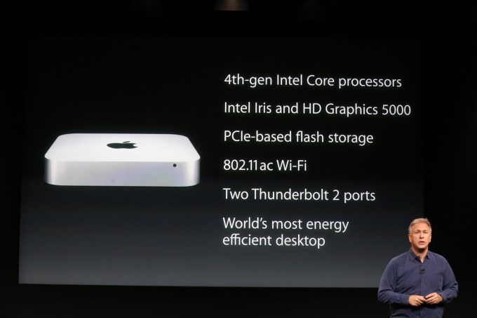
    The Mac Mini dropping to $499 means a lower entry point for ‘halo effect’ adopters of the Mac. Those who have an iPhone or an iPad and want to know what this Mac thing is all about.

    15 HOURS AGO

    Also shipping today.

    15 HOURS AGO

    Nothing crazy, but a nice overall spec refresh. And a price drop to $499.

    15 HOURS AGO

    And w’ere getting an update to the Mac Mini, a fan favorite machine, today as well.15 HOURS AGO

    15 HOURS AGO

    Matthew Panzarino15 HOURS AGO

    Retina iMac $2,499. AMD Radeon R9 M290X standard and R9 M295X upgrade. Ships today. Who’s going to tell my kid she’s not going to Disney?

    Darrell Etherington15 HOURS AGO

    Shipping today.

    Darrell Etherington15 HOURS AGO

    Darrell Etherington15 HOURS AGO

    Darrell Etherington15 HOURS AGO

    Darrell Etherington15 HOURS AGO

    Darrell Etherington15 HOURS AGO

    Matthew Panzarino15 HOURS AGO

    If you’re a journalist and you clap at these events your hands should catch on fire.

    Matthew Panzarino15 HOURS AGO

    Apple is now showing off a video of the innards of their new iMac panel that looks like an oil commercial. You know the ones, where you fly in through your engine and see the pistons firing off.

    Darrell Etherington15 HOURS AGO

    Darrell Etherington15 HOURS AGO

    Matthew Panzarino15 HOURS AGO

    Apple is very proud of both its technology and what it calls its technology.

    Darrell Etherington15 HOURS AGO

    Darrell Etherington15 HOURS AGO

    Matthew Panzarino15 HOURS AGO

    Apple created a new Oxide TFT display, and used organic passivation to reduce pixel crosstalk. Basically these speed up how fast it can refresh pixels and prevents color bleed between pixels. On top of that, it uses 30% less battery.

    Darrell Etherington15 HOURS AGO

    Darrell Etherington15 HOURS AGO

    Darrell Etherington15 HOURS AGO

    Darrell Etherington15 HOURS AGO

    Darrell Etherington15 HOURS AGO

    Darrell Etherington15 HOURS AGO

    Darrell Etherington15 HOURS AGO

    Darrell Etherington15 HOURS AGO

    Matthew Panzarino15 HOURS AGO

    “There are 7 times more pixels on the Retina 5k Display than there are on your HDTV” – Phill Schiller.

    Darrell Etherington15 HOURS AGO

    Darrell Etherington15 HOURS AGO

    Matthew Panzarino15 HOURS AGO

    And now we have an iMac with Retina display. 27″ display, 5,120 by 2,880 pixels. 14.7M pixels on one display. Schiller says this is the world’s highest resolution display. They’re calling it the Retina 5k display.

    Darrell Etherington15 HOURS AGO

    Darrell Etherington15 HOURS AGO

    Darrell Etherington15 HOURS AGO

    BlackBerry Collaborates with Porsche Design on a New Smartphone

    – via RobbReport

    Following the success of the Porsche Design P’9981 smartphone, which was one of the best-selling items at Harrods last year, the German carmaker and the Canadian smartphone manufacturer BlackBerry are at it again with a second model—the new Porsche Design P’9982, Blackberry’s first all-touchscreen phone. Available at Porsche Design stores and Harrods ($1,990), the phone has a satin-finish stainless-steel frame with an Italian-leather back that has been applied by hand. A limited-edition version, available in just 500 editions worldwide, is wrapped in crocodile and will be sold at Harrods only (approximately $3,750).

    The P’9982 runs on a custom version of the latest BlackBerry operating system, version 10.2, that features a clock modeled after Porsche Design’s Worldtimer timepiece, a BBM PIN that is unique to Porsche Design model owners, and the company’s new intelligent keyboard with an advanced predictive-text service. Additional services include the BlackBerry Priority Hub, which manages and filters conversations, notifications, and messages, and BBM Video, with screen-sharing capability. (www.blackberry.com)